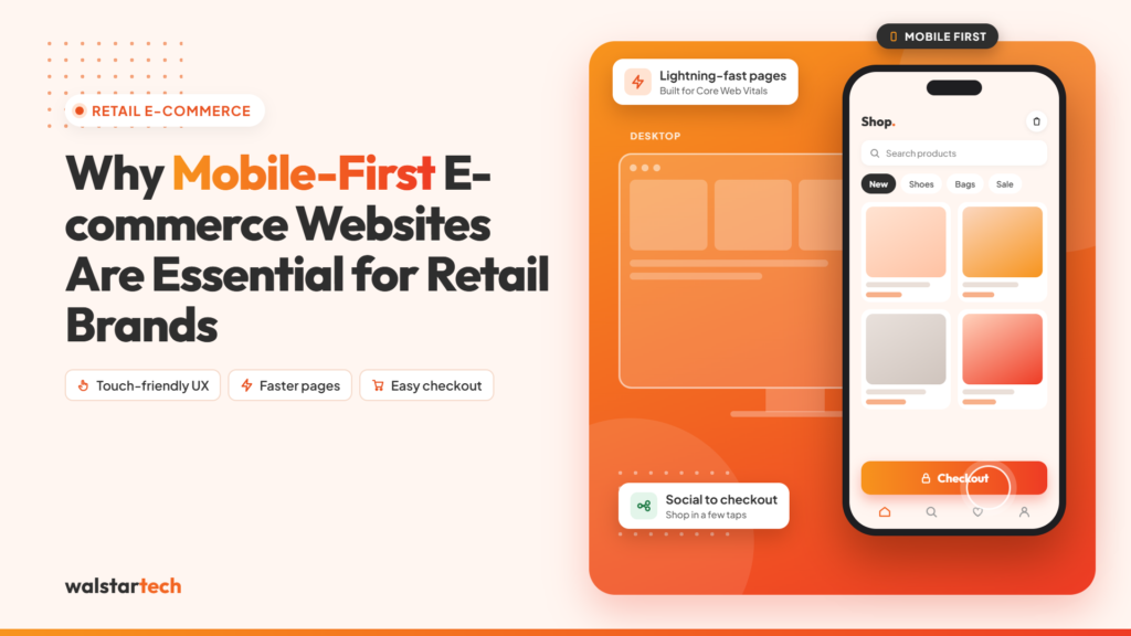
The way people shop has changed significantly. Customers now use smartphones to discover products, compare prices, read reviews, and complete purchases from almost anywhere. For retail brands, having an e-commerce website that provides an excellent mobile experience is no longer optional.
A mobile-first e-commerce website is designed with mobile users as the primary focus before adapting the experience for larger screens. This approach can help retailers improve usability, performance, customer engagement, and conversions.
Here are 10 key reasons why mobile-first e-commerce websites are essential for retail brands.
1. Customers Are Shopping on Mobile Devices
Smartphones are an important part of the modern shopping journey. Customers can discover a product through Google, social media, advertisements, or email and immediately visit an online store from their smartphone.
If the website is difficult to navigate or products are hard to view on a small screen, customers may leave.
A mobile-first approach ensures that important elements such as product pages, menus, buttons, images, and checkout are designed specifically for mobile users.
2. Provides a Better User Experience
A smooth user experience makes online shopping easier and more enjoyable.
Mobile-first e-commerce websites focus on:
- Simple navigation
- Touch-friendly buttons
- Readable text
- Clear product information
- Easy search functionality
- Mobile-friendly product filters
When customers can quickly find what they need, they are more likely to continue shopping and complete their purchase.
3. Improves Website Speed
Website performance is extremely important for mobile shoppers. Slow-loading pages can frustrate visitors and increase the chances of them leaving the website.
Mobile-first development encourages retailers to prioritize performance through:
- Optimized images
- Lightweight page designs
- Efficient code
- Lazy loading
- Browser caching
- Reduced unnecessary scripts
A faster website creates a smoother shopping experience and can support better engagement.
4. Makes Product Discovery Easier
E-commerce stores can contain hundreds or even thousands of products. Without effective navigation, customers may struggle to find the right item.
Mobile-first websites can use features such as:
- Smart search
- Product categories
- Filters
- Sorting options
- Product recommendations
- Recently viewed products
These features help shoppers find products faster and reduce unnecessary browsing.
5. Simplifies the Checkout Process
A complicated checkout process can cause customers to abandon their carts.
Mobile-first design focuses on making checkout quick and convenient by providing:
- Guest checkout
- Mobile-friendly forms
- Multiple payment options
- Digital wallets
- Secure payment gateways
- Clear shipping information
Reducing unnecessary steps can create a smoother path from Add to Cart to Purchase.
6. Supports E-commerce SEO
Mobile optimization is also an important part of an effective SEO strategy. Search engines evaluate mobile versions of websites when crawling and indexing content.
Retail brands should optimize areas such as:
- Mobile usability
- Page speed
- Core Web Vitals
- Responsive design
- Product pages
- Structured data
- Internal linking
A mobile-friendly website gives retailers a stronger foundation for attracting organic search traffic.
7. Connects E-commerce With Social Media
Social media has become an important product discovery channel for retail brands.
A customer might discover a product on Instagram, Facebook, TikTok, or another platform and click through to the retailer’s website using their smartphone.
A mobile-first website creates a smoother journey:
Social Media → Product Page → Shopping Cart → Checkout
If the landing page isn’t mobile-friendly, retailers risk losing customers before they make a purchase.
8. Builds Customer Trust
Customers want to feel confident when shopping online and entering their personal or payment information.
A professional mobile e-commerce experience can strengthen trust through:
- Secure HTTPS connections
- Clear product information
- Customer reviews
- Transparent pricing
- Shipping information
- Return policies
- Secure payment options
- Professional website design
A trustworthy website can make customers more comfortable completing purchases.
9. Encourages Customer Engagement
Mobile-first e-commerce websites can provide personalized experiences that encourage customers to return.
Retailers can integrate features such as:
- Personalized product recommendations
- Wishlists
- Loyalty programs
- Recently viewed products
- Special offers
- Customer accounts
- Order tracking
These features can help improve customer engagement and encourage repeat purchases.
10. Creates a Foundation for Future Growth
A mobile-first e-commerce strategy can help retailers build a scalable digital platform.
Modern e-commerce websites can integrate with:
- CRM systems
- ERP platforms
- Inventory management systems
- Marketing automation tools
- Analytics platforms
- AI-powered recommendations
- Customer support solutions
This allows retail brands to expand their digital capabilities as their business grows.
How Walstar Tech Can Help
Building a successful mobile-first e-commerce website requires more than making a desktop website responsive. Retailers need a combination of UX design, e-commerce development, performance optimization, security, integrations, and ongoing support.
WalstarTech helps businesses create modern digital commerce solutions designed around their customers and business objectives.
Our e-commerce solutions can include:
- Mobile-first e-commerce development
- Custom e-commerce websites
- UI/UX design
- Payment gateway integration
- CRM and ERP integration
- Inventory management integration
- SEO-friendly architecture
- Website performance optimization
- Security solutions
- Maintenance and support
Frequently Asked Questions (FAQs)
1. What is a mobile-first e-commerce website?
A mobile-first e-commerce website is designed primarily for smartphone users, with a focus on easy navigation, fast loading, touch-friendly features, and a simple checkout experience.
2. Why is mobile-first design important for retail brands?
Mobile-first design helps retail brands provide a better shopping experience for smartphone users, improve engagement, support SEO, and make it easier for customers to complete purchases.
3. Can a mobile-first website improve e-commerce conversions?
Yes. A simple navigation structure, faster performance, clear product information, and an easy checkout process can reduce friction and potentially improve conversion rates.
4. How does mobile-first design support e-commerce SEO?
Mobile-first design supports SEO by improving mobile usability, page speed, responsive layouts, Core Web Vitals, and the overall experience for users accessing the website on smartphones.
5. How can WalstarTech help with mobile-first e-commerce development?
WalstarTech can help retail brands build mobile-first e-commerce websites with custom development, UI/UX design, payment integration, SEO-friendly architecture, performance optimization, and ongoing support.
Final Thought
Mobile shopping has become an essential part of the modern retail experience. Customers expect online stores to be fast, easy to navigate, secure, and convenient on their smartphones.
For retail brands, mobile-first e-commerce development is a strategic investment that can improve the customer experience, support SEO, simplify checkout, and create a scalable foundation for growth.
If you’re planning to launch or upgrade an online store, making mobile-first design a core part of your e-commerce strategy can help your retail brand stay competitive in today’s digital marketplace.
WalstarTech can help you build a modern, mobile-first e-commerce website designed to deliver better customer experiences and support long-term business growth.